Looks Good to Me: Visualizations as Sanity Checks
Michael Correll, Mingwei Li, Gordon Kindlmann, Carlos Scheidegger. IEEE InfoVis 2018
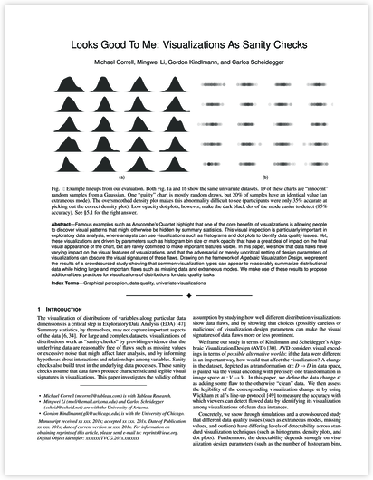
Famous examples such as Anscombe’s Quartet highlight that one of the core benefits of visualizations is allowing people to discover visual patterns that might otherwise be hidden by summary statistics. This visual inspection is particularly important in exploratory data analysis, where analysts can use visualizations such as histograms and dot plots to identify data quality issues. Yet, these visualizations are driven by parameters such as histogram bin size or mark opacity that have a great deal of impact on the final visual appearance of the chart, but are rarely optimized to make important features visible.
In this paper, we show that data flaws have varying impact on the visual features of visualizations, and that the adversarial or merely uncritical setting of design parameters of visualizations can obscure the visual signatures of these flaws. Drawing on the framework of Algebraic Visualization Design, we present the results of a crowdsourced study showing that common visualization types can appear to reasonably summarize distributional data while hiding large and important flaws such as missing data and extraneous modes. We make use of these results to propose additional best practices for visualizations of distributions for data quality tasks.
pdf.