This is the first in a series of posts I’m digging up from the old blog.
Say you want to hire a new employee. During the hiring process, you ask them to pass a drug test. Say 1% of the population uses drugs which are screened in the test, and that the test gets drug users 80% of the time. Finally, the test has a 10% false positive rate. Now your potential hire takes the drug test, and fails it. What are the chances he actually has used drugs? If you know the math, can you ballpark the result without working it out explicitly? If you don’t know the math, what’s your gut feeling? Take a moment to think about it.
Getting started
Most people get this sort of question horribly wrong, and yet this is the kind of situation in which we find ourselves all the time. Bayes’ Theorem, very loosely, what lets us turn observations of events into adjustments of our uncertainty about the world. With the theorem, it’s just a matter of writing the values out. But that’s not much fun; a more interesting way is to draw a picture. Let’s start with a couple of lines:
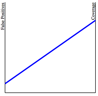
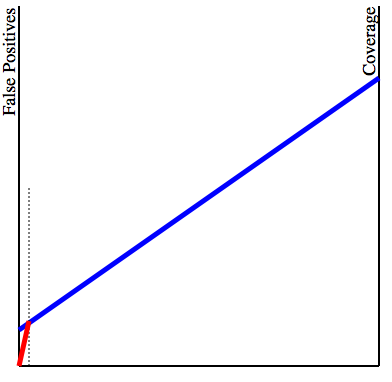
The left vertical line represents the false positive rate of the test, while the right vertical line represents what I’m calling the coverage of the test: how many drug users are actually caught when the test is performed. The blue line represents our particular test: the higher the endpoints are, the higher the probability of either a false positive or a “true positive”. We then add information about our population. We are assuming 1% of all people subject to the test use drugs. Then, we draw a vertical line 1% of the way from the left to the right lines. (I’m grossly exaggerating the distance here to make the drawing clearer). We now connect the intersection point to the lower-left corner:
The final picture
We are now almost ready to determine the probability that the potential hire was actually on drugs. We take note of the angle that the red line makes with the blue line, and draw a new parallel line which touches the right endpoint of the blue line. The chance the person was on drugs is exactly the proportion between the length of the horizontal segment cut off by the red line and the length of the full line:
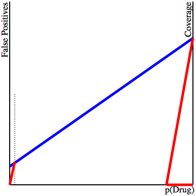
Notice that even with a grossly exaggerated proportion of the population doing drugs (the vertical dotted line is much farther right than 1% of the way), the actual chance that the person that got caught on the exam was doing drugs is still well below 20% (the actual value is 8%). Did you guess that? Most people guess a much higher value.
I like the physical aspect of this plot. After thinking about it for a bit, you can push the lines up or down in your head, and get a good idea for what happens to the result. This version is interactive: click on the black lines to set the three possible parameters. (In passing, I don’t know how to make this interactive SVG work when it’s linked as an IMG tag. Do you guys know how to do that?) To me it is natural that a lower rate of false positives will increase the chance that the test caught a real drug user. But it is not at all intuitive to me that the proportion of the population which actually uses drugs should have any influence on the test. But you can see that this is important by moving the slider around above. And now think of rare events, like cancer screening, or forensic DNA testing.
This is why I really like visualization. This drawing makes it pretty obvious what’s going on, and it also gives us a way to explore the space. Knock the lines around a little, and you can pretty quickly see the theorem, without having to work out the numbers.
But what’s going on behind the scenes, you ask? If you know Bayes’ Theorem, the height of the blue line at the intersection with the vertical is exactly $P(B)$; the cotangent of that angle is $P(A)/P(B)$, and since the vertical line on the right side is $P(B|A)$, the horizontal segment is $\frac{P(B|A)P(A)}{P(B)} = P(A|B)$, exactly what we needed. Cool!
Postmortem
Although I like the version above, and I was pretty pleased with myself when I came up with it, it turns out that someone improved my idea, and then traveled 30 years back in time to publish it in the New England Journal of Medicine! Fagan’s nomogram has the advantage of working in logarithmic scale, making the computation in case of very small probabilities much more precise.
I would like to understand better how it is that some visualizations become very effective external computing devices. I know a little about the work in external and distributed cognition in Infovis, but I would like something more concrete.