Simple Spatial Arrangements
Dot plots
When we want to show a single quantitative variable of interest, the dot plot is usually appropriate. A dot plot simply uses position along a common scale for encoding the variable. Here we use the OECD Employment Dataset, and start with the percentage of men employed in senior management:
This usually is a better visualization than bar charts, especially when data might have negative values. However, in both cases, one ought to worry about the order in which the dots are presented. The order of the dots is a necessary component of these “stacked” dot plots, and they might influence our perception of the plot:
A variation of the dotplot that is not affected by choice of ordering, and “collapses” all the points into a single y position:
Note that in this case one has to worry about label placement and orientation (more on that below). If it’s possible to include the plot in a location where tall figures fit nicely, vertical dotplots often work well 1.
Scatterplots
When we have two quantitative variables, the most natural chart is the scatterplot, which we’ve already had plenty of opportunity to create and analyze in class. A scatterplot uses position along $x$ for one of its variables, and position along $y$ for the other. In this section, we will again use the OECD Employment Dataset, but will directly compare the percentage of men employed in senior management in the $x$ axis to the percentage of women employed in senior management in the $y$ axis.
When the two variables share the same units, it’s often a good idea to make sure that the scales have the same domain. We do this to make it clear that in the case of strongly positively correlated variables, it might not be the case that the two variables are effectively equal. Compare the scatterplot above to the one below.
We can start to see a systematic difference between the two variables. Often, an unadorned scatterplot is sufficient for exploratory analysis. But one of the “secret” advantages of scatterplots is that it is often quite easy to add annotations to them in a way that’s intuitive and meaningful.
For example, in the scatterplot above, we can start to see that women are systematically employed in senior management than men. Once we decide that this is a pattern we seek to understand with our visualization, we can encode the “distance to equality” in a visual, direct way, by adding a line where $x=y$, and perpendicular connectors:
This is a subtle addition to the scatterplot, but the effects are quite evident. Now it becomes quite clear not only that all countries do employ fewer women in senior management than men, but that the gap is quite different from country to country. This happens because the annotation line we added provides an additional positional scale that we can read, namely the distance from the line.
Labels
Note that in scatterplots, label placement is surprisingly hard. Even in state-of-the-art libraries like ggplot2 and vega, good label placement is still either done manually or through additional code (see base vega vs vega-label, or base ggplot2 vs ggrepel). For example, here’s the kind of thing that happens when we label our scatterplot naively:
Transformations
Consider now a website like IMDB, which collects user-provided ratings for movies. We might be interested in the relationship between the perceived quality of a movie (encoded here by the average of the ratings a movie gets) and the popularity of said movie (encoded here by the number of votes it gets). According to our principles, we should use a scatterplot that compares both of them. This is the result, using a simple random sample of the actual IMDB ratings dataset of size 1000 (the full dataset has 981735 rows):
Something unexpected happens here. Most of the movies in the dataset have a very small number of votes, but a few movies have a very large number of votes. As a result, we cannot see any interesting variability in votes, and none if its potential relationship with ratings. But if we think about it for a bit, we realize that the current $y$ axis is not particularly useful. It spends as much vertical real estate in the difference between 0 and 10 votes as it does on the difference between 100000 votes and 100010 votes. That does not match our common sense. Instead, it makes more sense for an axis to track relative changes. The difference between 10 and 20 votes should take about as much space as the difference between 1000 and 2000 votes. What we need to plot in the $y$ axis, then, is the logarithm of the number of votes. This works because $\log (x \times y) = \log x + \log y$. A logarithm breaks up products (multiplicative, or “relative” changes) into sums (additive, or “absolute” changes):
Line charts
Often we have a numerical quantity that is natural to think of an independent variable, associated with a variable that we can think of as a dependent variable (that is, we can think of the dataset as a function that maps independent variables to variables). In these cases, a line chart is often a good representation.
Consider this chart of the concentration of CO2 in the atmosphere, measured at Mauna Loa:
Even though we only have a finite set of measurements (in this case, 12 measurements per year), it makes more sense to connect those measurements with a curve than it is to simply plot those measurements as discrete points. In situations where the measurements are not evenly spaced, or when the precise values of the existing data points are important, we can include specific markers for the data points:
Banking to 45
Notice a different phenomenon in this last chart. In it, we can tell that the leading edge of the sawtooth pattern rises slower than the trailing edge falls. You might think that this was visible simply because we’re sufficiently zoomed in here, but that’s not the entire explanation.
There exists a perceptual phenomenon unique to line charts: we tend to perceive slope variation more readily when it happens at around 45 degrees. This means that when we design line charts, there exists one additional degree of freedom that we haven’t considered before: the ratio between width and height of the overall chart. In a scatterplot (with axes of unrelated units), we are free to choose width and height independently. With line charts, the choice of ratio makes a real difference. In the chart below, notice how we can tell the difference between the trailing and leading edges, even though we’re just as zoomed out as before:
To further convince you that slope is responsible for this perception, consider this variation of the zoomed-in chart:
Zeros or no zeros?
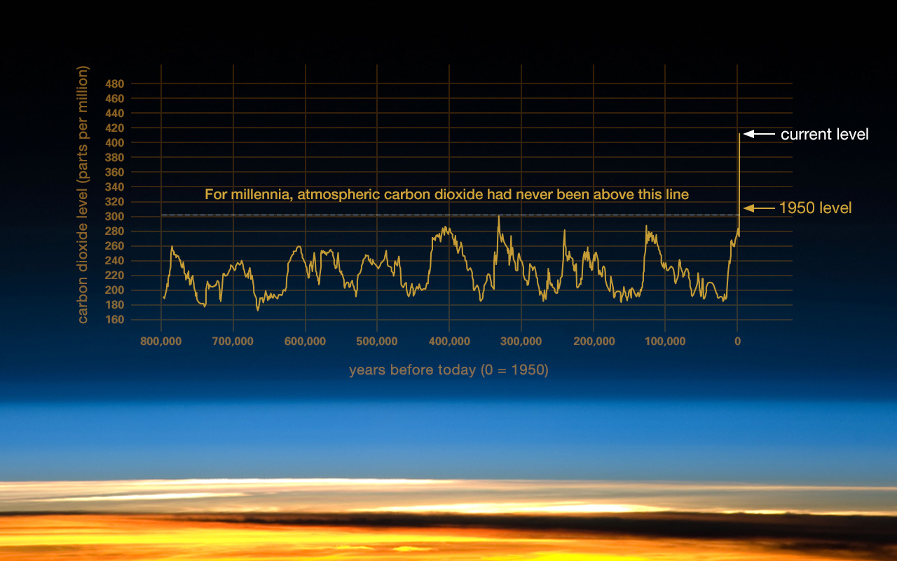
One of the most common pieces of advice for drawing simple lines and bar charts is: “in order not to mislead, always include the zeros”. This is, sometimes, good advice. Which of these two plots misleads, and how?
Of course, including all of the historical evidence we have, and adjusting the axes appropriately for both $x$ and $y$, we end up with this plot instead, from NASA’s Climate Resources:
Bar charts
TBF.
Stacked bar charts
TBF.
Small Multiples
When a dataset has too many variables, a natural temptation is to create a single large chart in which each of the variables is mapped to a different visual channel. This is intuitive, but it’s almost always a bad idea: as we’ve seen before, visual channels interact with each other in complicated ways.
Consider this (bad!) chart:
A better idea is to use small multiples: instead
Fancy spatial arrangements
- Streamgraphs: 1, 2
- Horizon Charts
Data
-
OECD Employment Data. This data is provided courtesy of Jonathan Schwabish and Catherine Rampell, by way of the OECD.
-
IMDB Ratings Data. A lot of the data from IMDB is available publicly for personal and non-profit uses, and is updated regularly.
-
Atmospheric CO2 We use Scripps’s long-running measurements of CO2 concentration on Mauna Loa, specifically the standard value described in column 5 of the file. We use the longest contiguous range of data for which observations exist. As of the time of writing this, the range was 1964-05 through 2019-09.